Last May 4, 2015, we noted that Construction Gross Value (Construction GV) at 11.21% as of the year-end 2014 was already well above its historical average of 9.59% of GDP since 1990. This ratio has run at an above average rate since 2009 and has already eaten away at the "cumulative underhang" or underinvestment in construction that has taken place since 2004, when the excessive investment in construction that took place in the mid to late 1990's was being absorbed.
As of the 4th Qtr of 2015, Construction GV as a percentage of GDP now stands higher at 11.89% of GDP - near an all-time high for the past 25 years. But the real story is that Cumulative Construction GV has gone well above equilibrium and now stands at 3.8% above equilibrium, a rise of 2.4% in just one year. Given all the planned new projects that are already at the execution stage, the momentum in Construction Investment will continue.
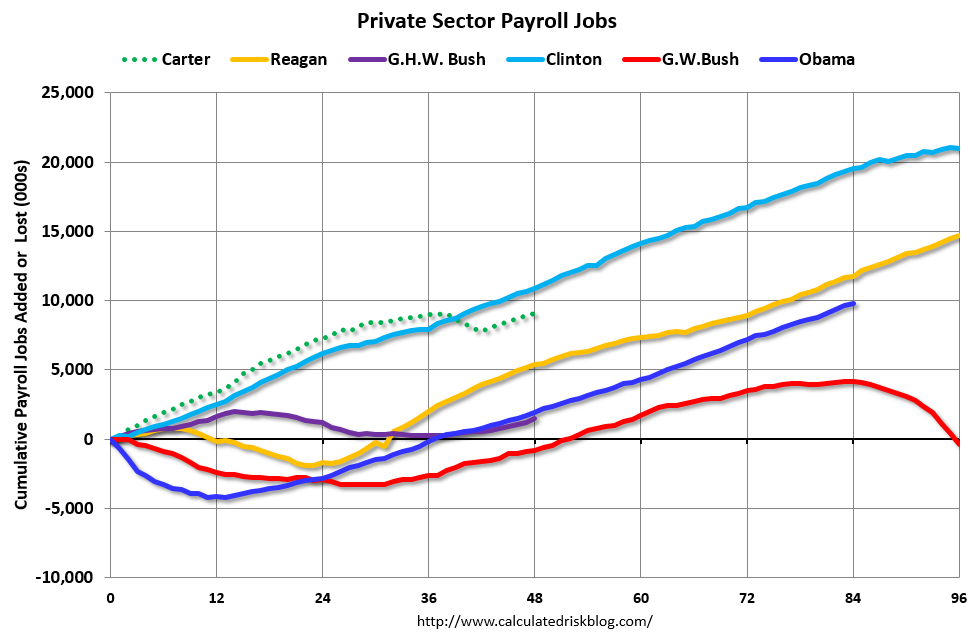
Obama has added 10.3 million jobs since the start of his term. He ranks just below President Clinton and President Reagan in terms of absolute number of jobs created.
This is a considerable feat, given what he had to start with since he was ushered into power right in the middle of the steepest recession since WWII.
Despite all this, people are angry. They want to vote for a guy like Donald Trump anti-immigration rhetoric that began with his Presidential Announcement last June has inspired the resurgence of white nationalists all over the country.
,
Normally, these type of comments would sound the death knell for any politician. But these are not normal times and Donald Trump is not your normal politician. Donald Trump has continued to maintain a commanding lead in the Republican primaries.
So what gives? Why are people so angry? Why has the likes of Donald Trump struck a chord with so many American voters?
One simple reason: Foreign Born Workers.
Foreign Born Workers are an ever increasing part of the Civilian Non-Institutional Population (the working age population:
Although Foreign Born and Native Born workers have similar unemployment rates:
And the proportion of unemployed Foreign Born workers has remained pretty constant:
Foreign Born workers have significantly higher labor force participation rates:
This means that more of them want jobs. Therefore they are an increasing percentage of the Total Civilian Labor Force (those who have jobs and those who don't have jobs and are looking for work.
And more of them are finding jobs at a higher rate than Native Born Workers:
As a result, Foreign Born workers are an ever increasing percentage of those with jobs.
So most of the job growth since the start of the December 2007 recession has gone to Foreign Born workers.
As a result, wages continue to stagnate:
Sources: St. Louis Federal Reserve, Calculated Risk, BLS.GOV, Pew Research, Washington Post, Real Clear Politics
The reported unemployment rate during the Great Depression was significantly higher than the reported unemployment rates of the Great Recession.
But are the two rates comparable? Before 1938, children were a significant part of the labor force. In 1900, children younger than sixteen made up as much as eighteen percent of the labor force. It was only when the Fair Labor Standards Act of 1938 became law that children younger than sixteen were barred from working in manufacturing and mining but not agriculture. To make the numbers more comparable, it is better to get the ratio of Employment to the Total Population (which includes children). When we do this, the two measures are not so far apart. In 1929, the year "0" for the Great Depression, 54.41% of the total population was employed. By 1933, year "4", only 41.97% of the population was employed. But the rise in employment was dramatic. Four years later, 47.63% of the population was employed, almost six percentage points higher. The employment momentum only stalled when the tax hikes of 1937 induced another recession in 1938 and new child labor laws barred children from the labor force. If the momentum had continued, the employment ratio would have recovered in less than five years. In 2007, the year "0" of the Great Recession, 48.38% of the population was employed. Four years later, only 44.82% of the population was employed, a drop of less than 4 percentage points. By January 2016 or four years after the Great Recession bottomed out, only 46.62% of the population is employed, an increase of only 1.93% percentage points. The growth rate of employment was less than a third that of the Great Depression. At this rate, it will take five more years or 2021 before employment recovers to that of Year "0".
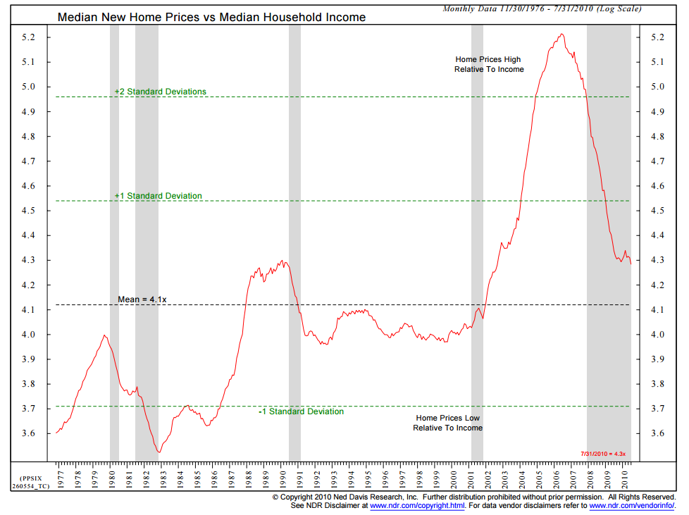
"the ratio of home prices to income began to tick up in the early 2000s. By 2002, it was approaching its 1980s highs. It was a standard deviation away from the norm by 2004, and it reached at 2 1/2 times the norm in 2005.Housing, as a few of us observed long before the financial crisis bloomed, was a debacle about to happen.
The housing boom drove employment in construction, mortgage brokerage, home furnishings and durable goods. We even had a bull market in real-estate agents. People pulled cash out of their homes at furious rates to fund renovations at first, then big-screen televisions, automobiles and vacations. The broader way to understand this is that wages were stagnant, inflation was starting to rise and rather than accept a drop in living standards, people used home equity to maintain consumption."
I noticed that the chart from Ned Davis Research only covered the period from 1977 to 2010. Home Prices, as indicated by the S&P/Case-Shiller 20-City Composite Home Price Index, have increased substantially since then.
So what does an updated version of the Ned Davis Research Chart look like right now? It looks like this:
The ratio of Median New Home Prices to Median Household Income has surpassed the highs of the last housing bubble and is once again more than two standard deviations above the norm - clearly unsustainable. Housing is once again a debacle waiting to happen.